000 / 100


Websites : portfolio & 3D gallery
Developer front-end / 3D, Designer
2021 - 2022
Sereno Creatives project
2 months part time
wordpress
three
scss
Highlight illustrations & offer an innovative way to stand out from the competition
1
Have a 3D gallery close to the artist's universe
2
Optimize the gallery for mobile
3
Highlight the works, in a 3D environment
4
Have a classic site to accompany the 3D gallery
The 3D gallery appeared obvious in the period in which it was made. Indeed, we are in the middle of Covid, 'online museums experience' are still rare but are starting to emerge, and I said to the client that it would be relevant to do one in our case.
My approach was as follows: tell a story to give heart to the M3I brand, then highlight the illustrations. The site also had to be scalable over time and had to be part of a module logic: a 3D module, a shop module, a classic Wordpress module, etc.
With busy illustrations, there was no need to have too strong a graphic identity. I chose to stay in shades of gray with noise on it, then I chose tones of blue that are reminiscent of the logo. The typography is simple, easy to read, and in all caps to give a less basic feel.

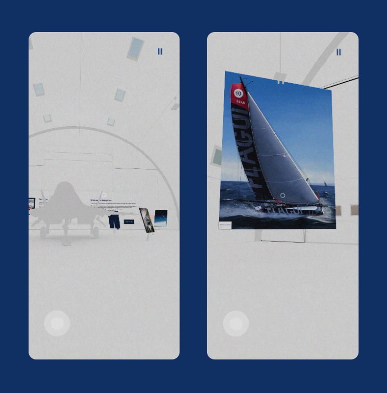
The illustrator wanted an environment that would recall the military side of his illustrations. We therefore went with a hangar with a plane in the middle, all in a very light gray color so as not to make the paintings invisible, placed on easels.

For performance reasons on all the devices that were going to come to the site, it was necessary to have a number of triangles less than 100,000 for the entire scene at a time. We also had to bake the lights in a texture, put all the paints in a single texture... These paints also had to have sufficient quality and not too low so as not to make them 'ugly' and move away from the objective to sublimate them. So it was a lot of going back and forth between blender and the development site.

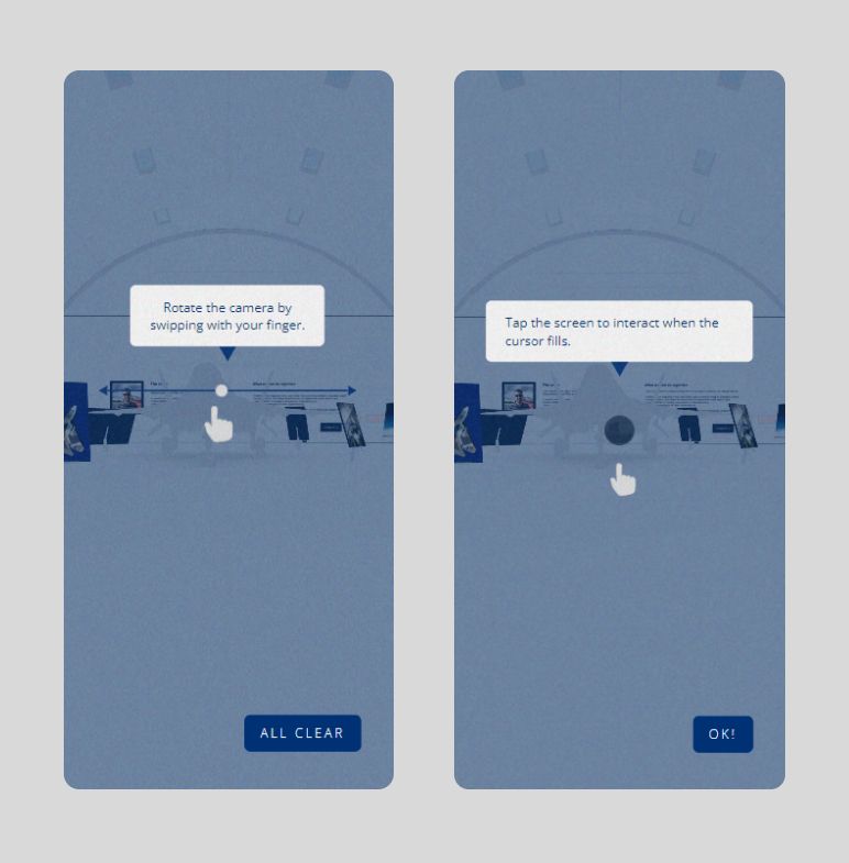
One of the challenges linked to mobile, beyond performance, was to do mobile onboarding which explained the principles of navigation without any hassle. Yet another challenge was to make user movement possible with one hand on a phone by adapting the player controller code originally designed for a PC. We needed a joystick, to carry out vector calculations at the camera level, and above all to try to transcribe the feeling of moving and looking in space we had on PC.


As for the classic portfolio, I paid particular attention to text animations and parallaxes to once again highlight the illustrations.

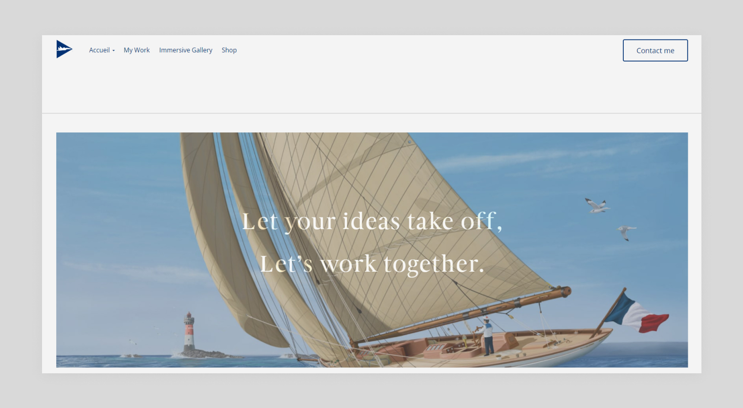
These 2 portfolios gave this illustrator a good start in his career, giving him visibility and credibility in the eyes of potential clients. As a result, he was able to work for aeronautical magazines such as Air & Cosmos, and for model-making companies. These websites are complementary business cards. The gallery is designed to create a wow effect, and leave a unique impression on the customer, while the more traditional site allows him to delve deeper into the creative process and take a closer look at the illustrations. All in all, it's been a positive experience, and apart from some minor stylistic adjustments, both sites have convinced M3I and its customers. In conclusion, this was one of the first freelance projects I did, and one of the most demanding I've ever had to work on. It was on this project that I started integrating higher standards into my design and development projects: classes for JavaScript, Docker for Wordpress...