000 / 100
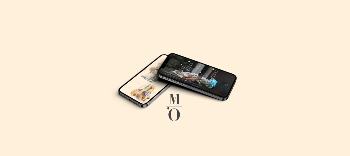
Web app part of a full system.
Developer Frond-End & 3D
2022
2 developers, 3 designers
8 weeks part time
TypeScript
scss
three
gsap
Orsay has partnered with Gobelins to bring their museum up to date by imagining new digital use cases for their museum.
1
Imagine a device to 'augment' creations in depth
2
Focus only on the Art Nouveau gallery
3
Respond to a real problem
4
Propose a viable, scalable MVP.
We went to the museum to meet the people in charge of the museum's digital modernization initiative. We listened to them, to their needs... and to their knowledge too.
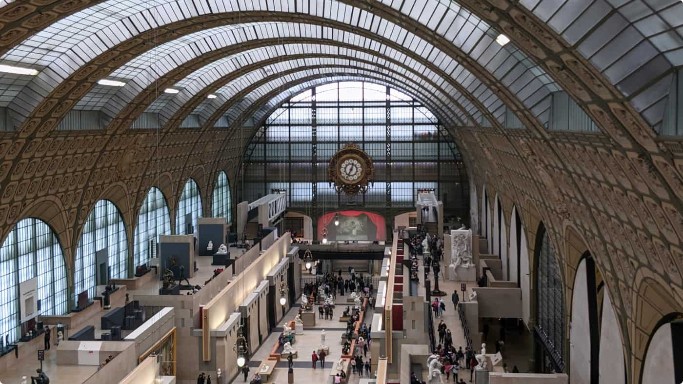
We observed the works in the Art Nouveau galleries of the Musée d'Orsay. Some works had stories to tell: A particular creative context. Special manufacturing techniques. Special symbolism....
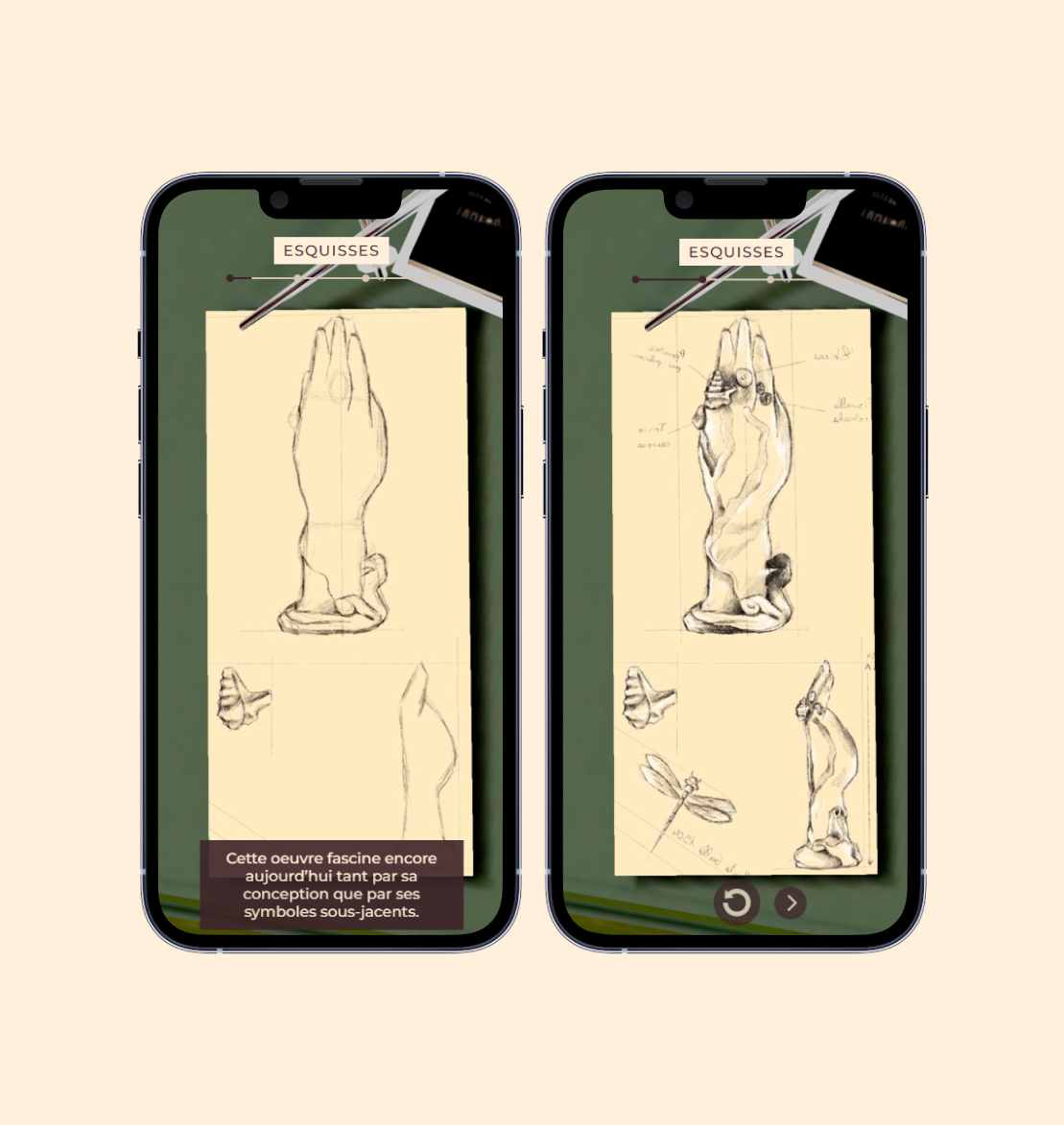
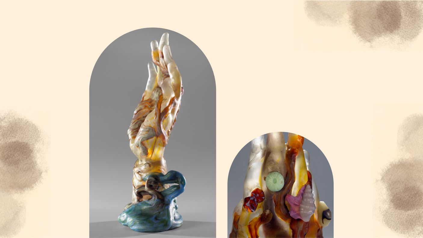
We came across a work by Emile Galée called La main aux algues (1904). Unique, intriguing and with a history that is still mysterious today, this work was an obvious choice for us.
While exploring a museum, you might seek additional information about a particular artwork. Varied levels of general knowledge exist among visitors, especially concerning works found in certain art collections. Certain information remains elusive to the average museum-goer.
We were aware that the Orsay Museum boasts an extensive library containing comprehensive information about its entire collection. There are individuals dedicated to gathering information daily about each artwork within the museum; it's their profession. Hence, we saw an opportunity to leverage this valuable resource.
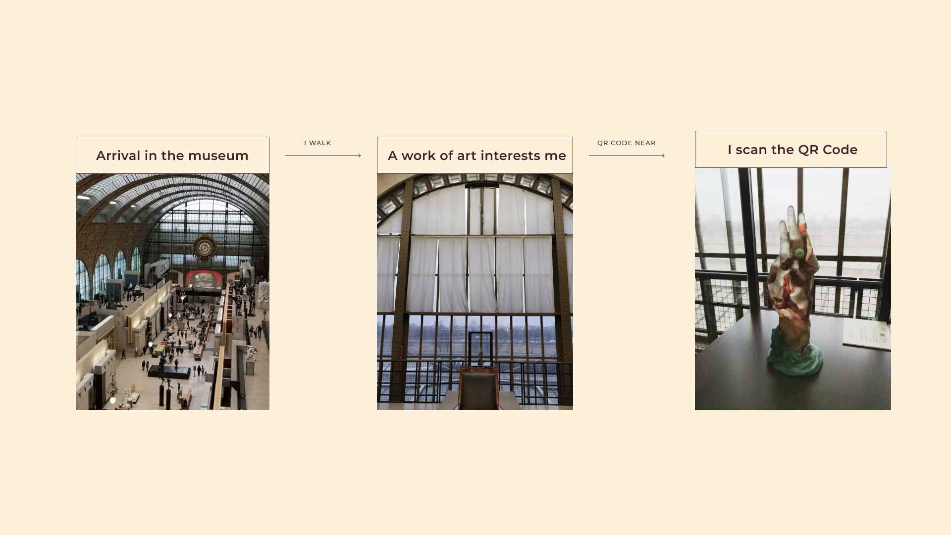
By scanning a QR code near the art you're interested in, you can find out more about it on a dedicated website.
Our ambition is to allow each visitor to learn more about a work of art during their visit to the museum.
Our user journey is divided into six parts. You enter the museum, freely explore, and find yourself drawn to particular artworks. After scanning a QR Code assigned to each artwork, you're directed to a dedicated website.
Here, you discover historical and unique information about the artwork. After looking at the content, if you desire further exploration, you can engage in another experience with your camera in Augmented Reality. The goal is to provide more in-depth detail with points of interest of the work.
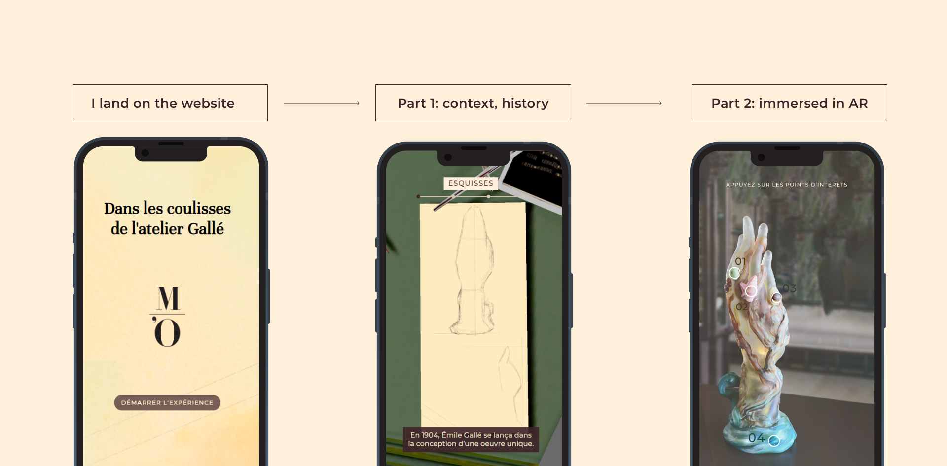
We concentrated solely on Gallée's work. We tried to do the AR part, but couldn't manage it in the time available. So we decided to concentrate entirely on the website part of the system, while continuing to think about the whole system, in case we needed to develop the whole project later.
We had numerous features packed inside our POC.
1
Instagram story-type system to attract the user's attention.
2
A simple user interface for indoor museums.
3
Subtitles if there's noise around
4
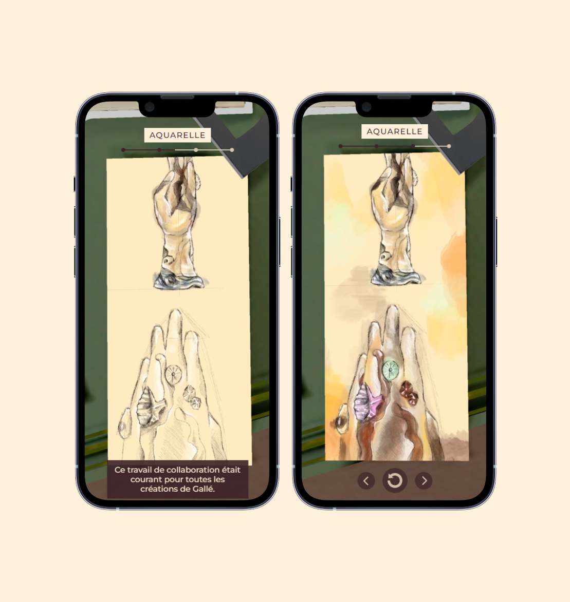
Hybrid visuals: 2D illustrations and 3D models.


1
Technology is a means, not an end
Initially, we designed an all-3D solution, but 2D does the job very well, and even better in some cases. That's why we decided to adopt a hybrid approach for this project, and even more generally to use 3D only if it serves a purpose.
2
Museums resist new tech.
Museums, including the Musée d'Orsay, often resist adopting new technological solutions due to various reasons, making it challenging to implement new initiatives.
Producing a proof of concept in just a few days is no easy task, especially for a demanding client like the Musée d'Orsay. It's also worth remembering that part 2 of the system with augmented reality was not feasible at the time, due to the web APIs available. However, this didn't stop us from producing a functional POC for mobile web, with a realistic and credible use case. We also had to abandon certain ideas during the design stage, but that's normal in the creative process. Although the Musée d'Orsay did not reuse our solution despite the fact that we were the most relevant of all those presented, it remains a highly formative project because of the real museum problems it is trying to solve.